
Issue #1073
ScrollView started as a plain container in SwiftUI. Every release since iOS 17 has added modifiers to it: paging, snapping, reading the offset, reacting to phases, and with iOS 26 the edge effects that sit under Liquid Glass bars. iOS 27 adds bars that minimize as you scroll and swipe actions outside List.
This post walks through all of them, grouped by what you want to do, with the OS version each one needs.
The basics
A handful of modifiers change how the scroll view looks and feels without any state. Most of them are from iOS 16 and 17, so they work on anything you still support.
ScrollView {
    content
}
.scrollIndicators(.hidden)                          // iOS 16
.scrollBounceBehavior(.basedOnSize)                 // iOS 16.4, no bounce when content fits
.scrollDisabled(isEditing)                          // iOS 16
.scrollDismissesKeyboard(.interactively)            // iOS 16
.scrollClipDisabled()                               // iOS 17, let shadows draw outside
.scrollIndicatorsFlash(onAppear: true)              // iOS 17
.contentMargins(.horizontal, 20, for: .scrollContent) // iOS 17
contentMargins is the one worth knowing well. Unlike padding on the content, it insets the content inside the scroll view while the scroll view itself stays edge to edge, so content scrolls under the margin instead of being clipped by it. Pass .scrollIndicators as the placement to move only the indicators.
scrollContentBackground(.hidden) hides the system background of scrollable views like List and Form, so your own background shows through. scrollInputBehavior(_:for:) from iOS 18 turns specific inputs on or off, but its input kinds are watchOS (handGestureShortcut) and visionOS (look) only.
Paging
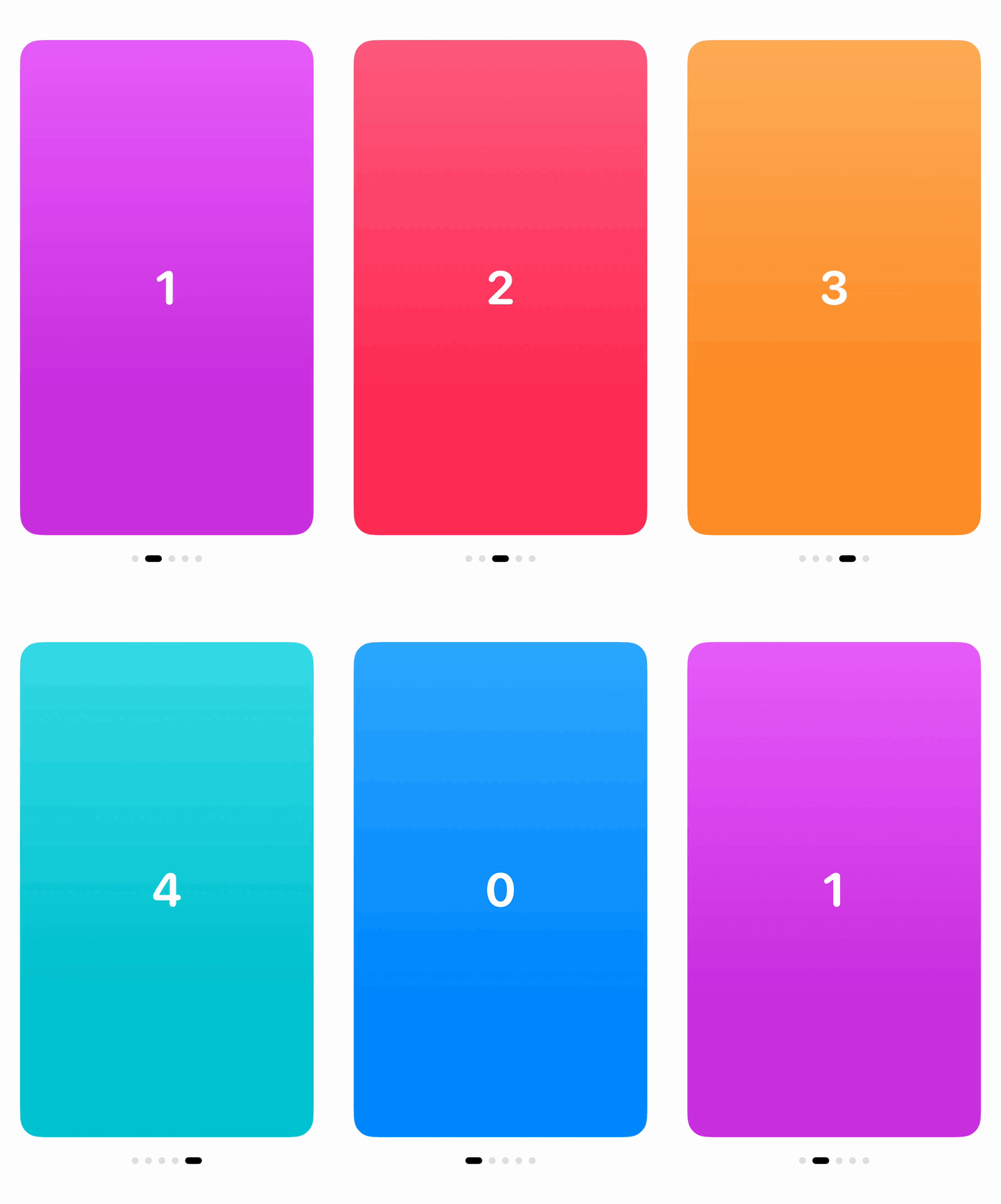
scrollTargetBehavior(.paging) snaps a scroll view to multiples of its own size. Pair it with containerRelativeFrame(.horizontal) so each page is exactly as wide as the scroll view.
struct PagingView: View {
    private let pages = Array(0..<5)
    @State private var position = ScrollPosition(id: 0)

    var body: some View {
        VStack(spacing: 24) {
            ScrollView(.horizontal) {
                LazyHStack(spacing: 0) {
                    ForEach(pages, id: \.self) { page in
                        DemoCard(index: page)
                            .padding(.horizontal, 24)
                            .containerRelativeFrame(.horizontal)
                    }
                }
                .scrollTargetLayout()
            }
            .scrollTargetBehavior(.paging)
            .scrollIndicators(.hidden)
            .scrollPosition($position)

            PageDots(count: pages.count, current: position.viewID(type: Int.self) ?? 0)
        }
    }
}
.paging doesn’t need scrollTargetLayout() to snap. It’s there so scrollPosition knows which views to track, which is what drives the page dots. viewID(type:) returns the id of the page currently in view.
Snapping to views
Paging works on the scroll view’s size. When the items are narrower than the screen, use .viewAligned instead, which snaps to the views marked with scrollTargetLayout(). Combine it with contentMargins so the neighbors peek in from both sides, and scrollTransition to shrink cards as they leave the center.
ScrollView(.horizontal) {
    LazyHStack(spacing: 16) {
        ForEach(0..<8, id: \.self) { index in
            DemoCard(index: index)
                .frame(width: 260, height: 380)
                .scrollTransition { content, phase in
                    content
                        .scaleEffect(phase.isIdentity ? 1 : 0.85)
                        .opacity(phase.isIdentity ? 1 : 0.5)
                        .rotationEffect(.degrees(phase.value * 6))
                }
        }
    }
    .scrollTargetLayout()
}
.contentMargins(.horizontal, 70, for: .scrollContent)
.scrollTargetBehavior(.viewAligned(limitBehavior: .alwaysByOne))
.scrollIndicators(.hidden)
phase.isIdentity is true when the card is fully visible. phase.value goes from -1 on the leading side to 1 on the trailing side, which gives the tilt its direction.
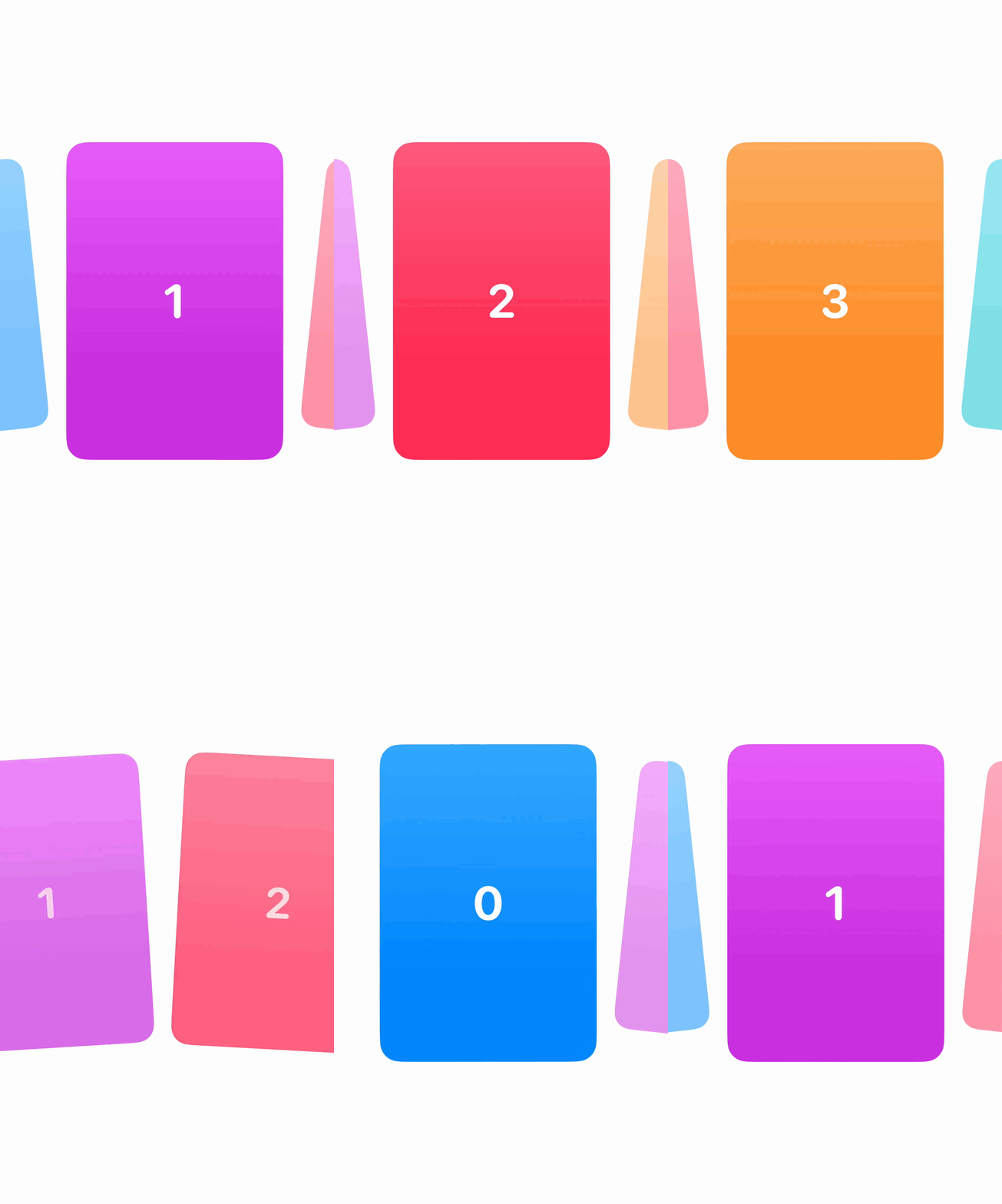
The limit behavior decides how many views one swipe can move. .automatic, .always and .never choose whether a swipe is limited at all. iOS 18 added .alwaysByOne, which moves one view per swipe like the demo above, and .alwaysByFew, which allows a few. iOS 26 added an anchor so views can snap to a point other than the leading edge:
.scrollTargetBehavior(.viewAligned(limitBehavior: .alwaysByOne, anchor: .center)) // iOS 26Scroll position
iOS 17 had scrollPosition(id:), which binds to the id of a view. iOS 18 replaced it with the ScrollPosition type, which can also scroll to an edge or an exact point.
@State private var position = ScrollPosition(edge: .top)

ScrollView {
    rows
}
.scrollPosition($position)

// Later, inside withAnimation if you want it animated
position.scrollTo(edge: .bottom)
position.scrollTo(id: message.id, anchor: .top)
position.scrollTo(y: 600)
Reading it back is just as useful. isPositionedByUser tells you whether the person scrolled it themselves, viewID and edge tell you what it was last scrolled to, and since iOS 26 x and y return the offset when it was positioned by a point.
For the starting position, defaultScrollAnchor(.bottom) from iOS 17 opens a chat at the latest message. iOS 18 splits it into roles, so you can start at the bottom but still align short content to the top:
ScrollView {
    messages
}
.defaultScrollAnchor(.bottom)                       // initial offset and size changes
.defaultScrollAnchor(.top, for: .alignment)         // iOS 18, short content stays at the top
The roles are .initialOffset, .sizeChanges and .alignment.
Reading the offset
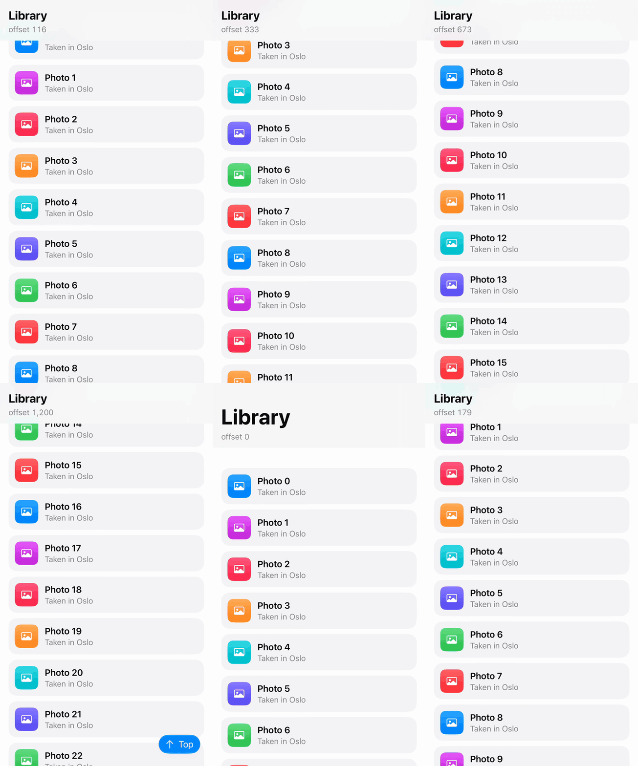
Before iOS 18, reading the scroll offset meant a GeometryReader inside the content and a preference key. onScrollGeometryChange replaces all of that. You give it a transform from ScrollGeometry to an Equatable value, and the action only runs when that value changes.
@State private var offset: CGFloat = 0
@State private var showsTopButton = false

ScrollView {
    rows
}
.contentMargins(.top, 160, for: .scrollContent)
.onScrollGeometryChange(for: CGFloat.self) { geometry in
    geometry.contentOffset.y + geometry.contentInsets.top
} action: { _, newValue in
    offset = newValue
}
.onScrollGeometryChange(for: Bool.self) { geometry in
    geometry.contentOffset.y > geometry.containerSize.height
} action: { _, newValue in
    withAnimation {
        showsTopButton = newValue
    }
}
contentOffset.y starts at minus the top inset, so adding contentInsets.top makes it 0 at rest. The header uses the offset to shrink its title, and the second call maps the geometry to a Bool, so the button’s action runs twice per trip down the list instead of on every frame. Transform to the smallest value you need.
ScrollGeometry also has contentSize, visibleRect and bounds, which covers things like “load more when near the bottom”:
.onScrollGeometryChange(for: Bool.self) { geometry in
    geometry.visibleRect.maxY > geometry.contentSize.height - 300
} action: { _, isNearEnd in
    if isNearEnd {
        loadMore()
    }
}
Phase and visibility
iOS 18 also added three callbacks for what the scroll view is doing and what’s on screen.
@State private var phase: ScrollPhase = .idle
@State private var visibleRows: [Int] = []
@State private var isFeaturedVisible = false

ScrollView {
    LazyVStack(spacing: 10) {
        ForEach(0..<40, id: \.self) { index in
            DemoRow(index: index)
                .onScrollVisibilityChange(threshold: 0.8) { isVisible in
                    if index == 20 {
                        isFeaturedVisible = isVisible
                    }
                }
        }
    }
    .scrollTargetLayout()
}
.onScrollPhaseChange { _, newPhase in
    phase = newPhase
}
.onScrollTargetVisibilityChange(idType: Int.self) { ids in
    visibleRows = ids
}
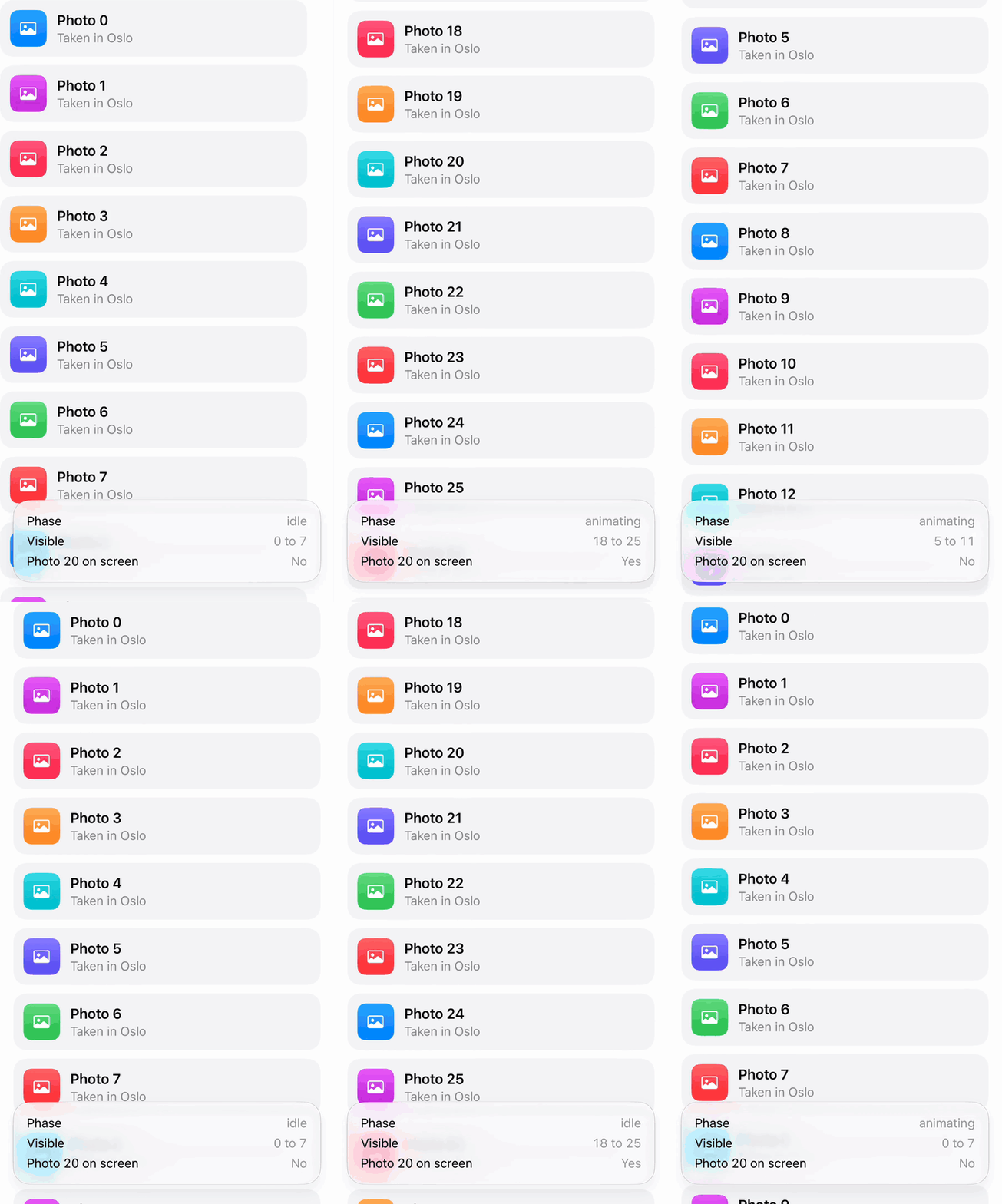
onScrollPhaseChange reports .idle, .tracking, .interacting, .decelerating and .animating. Scrolling in code with ScrollPosition reports .animating, while a finger drag goes through .interacting and then .decelerating. Use newPhase.isScrolling to pause expensive work while the list moves. A second overload passes a context with the geometry and the velocity when the phase changes.
onScrollTargetVisibilityChange goes on the scroll view and gives you the ids of the target views that are at least half visible. onScrollVisibilityChange goes on one view and tells you when that view crosses the threshold, which suits autoplaying a video or logging an impression.
Edge effects in iOS 26
With Liquid Glass, bars float over the content instead of sitting on an opaque background. To keep their content readable, iOS 26 draws a scroll edge effect under them: content fades and blurs as it scrolls into the bar. You get it for free under navigation bars and toolbars, and you can tune it per edge.
ScrollView {
    cards
}
.scrollEdgeEffectStyle(.soft, for: .top)    // or .hard, .automatic
.safeAreaBar(edge: .top) {
    Text("Soft")
        .font(.headline)
        .padding(.horizontal, 20)
        .padding(.vertical, 10)
        .glassEffect()
}
.automatic lets the system pick a style for the platform and context. .soft is a subtle blur that gets more opaque toward the edge. .hard is a nearly opaque band with a straight line where it ends. scrollEdgeEffectHidden(true, for: .top) removes the effect for that edge.
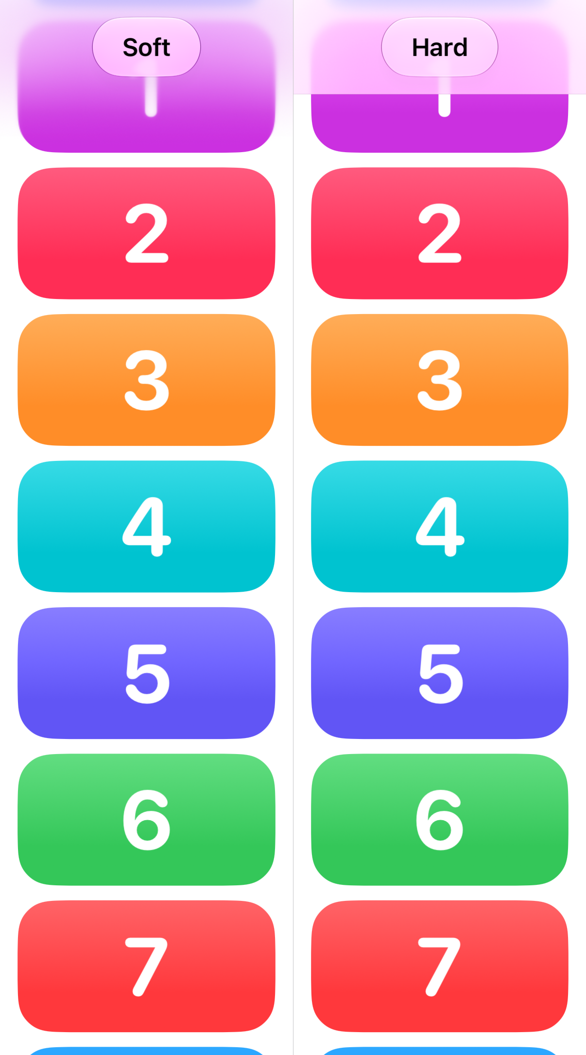
The bar in the demo is a custom view, added with safeAreaBar from iOS 26. It insets the safe area like safeAreaInset does, and also extends the scroll edge effect under your bar, like the “Soft” and “Hard” pills above.
Two more iOS 26 modifiers are related. backgroundExtensionEffect() places blurred, mirrored copies of a view, typically a banner image in the detail column, under a sidebar or inspector so it looks like it continues behind it. tabBarMinimizeBehavior(.onScrollDown) on a TabView minimizes the tab bar while the person scrolls down and expands it again when they scroll back up.
Bars that minimize in iOS 27
iOS 27 brings the tab bar trick to every bar. toolbarMinimizationBehavior(_:for:) minimizes a navigation bar or toolbar as the person scrolls:
NavigationStack {
    ScrollView {
        rows
    }
    .toolbarMinimizationBehavior(.onScrollDown, for: .navigationBar)
    .toolbarMinimizationRestoration(.atScrollEdge, for: .navigationBar)
}
The behaviors are .automatic, .onScrollDown, .onScrollUp and .never. By default the bar comes back as soon as the person scrolls the other way. .atScrollEdge keeps it minimized until the content is back at the top, which fits bars that are mostly chrome. Today that restoration option only works for .navigationBar combined with .onScrollDown.
toolbarMinimizationSafeAreaAdjustment(_:for:) decides whether the content’s safe area shrinks along with the bar. All the options except .automatic are iOS only.
Swipe actions outside List in iOS 27
swipeActions used to work only on List rows. In iOS 27 it works on rows in any scroll view once the container is marked with swipeActionsContainer():
ScrollView {
    LazyVStack {
        ForEach(photos) { photo in
            PhotoRow(photo)
                .swipeActions {
                    Button("Delete", systemImage: "trash", role: .destructive) {
                        photos.removeAll { $0.id == photo.id }
                    }
                }
        }
    }
}
.swipeActionsContainer()
Without swipeActionsContainer() the row modifier does nothing outside a List. A new overload adds onPresentationChanged, which tells you when a row’s actions are shown or hidden.
iOS 27.1 also adds contentMargins(for: .container), which applies the margins of the container a view is in. .container is the first ContentMarginGuide, and you can also read its value from a GeometryProxy.
Start the conversation