
Issue #1072
SF Symbols ship with thousands of icons, and most apps use them as plain tinted images. That leaves a lot on the table. Each symbol is built from layers, comes in several shapes and weights, can show a value, and can move. This article walks through every styling option and every animation SwiftUI offers for symbols, with what each one looks like.
All code below runs on iOS 26 and macOS 26 unless noted. Many features work further back, and the version is called out where it matters.
Rendering modes
A symbol is made of up to three layers: primary, secondary and tertiary. The rendering mode decides how those layers get colored.
Image(systemName: "cloud.sun.rain.fill")
    .symbolRenderingMode(.monochrome)
    .foregroundStyle(.blue)

Image(systemName: "cloud.sun.rain.fill")
    .symbolRenderingMode(.hierarchical)
    .foregroundStyle(.blue)

Image(systemName: "cloud.sun.rain.fill")
    .symbolRenderingMode(.palette)
    .foregroundStyle(.blue, .orange, .green)

Image(systemName: "cloud.sun.rain.fill")
    .symbolRenderingMode(.multicolor)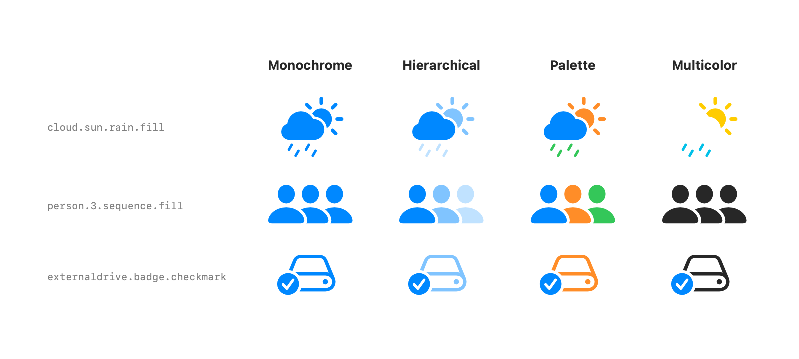
Monochrome paints every layer with the same color, and it’s the default. Hierarchical uses one color but fades the secondary and tertiary layers, which gives depth without picking more colors. Palette takes one style per layer from foregroundStyle, in layer order.
Multicolor uses the colors Apple designed for the symbol, like the yellow sun above. Not every symbol has a multicolor version. The ones that don’t render like monochrome in the default foreground color, as person.3.sequence.fill and the drive show.
Variants
Many symbols come in related shapes: filled, inside a circle, inside a square, crossed out. You can type the full name, like heart.circle.fill, or keep the base name and apply a variant.
Image(systemName: "heart")
    .symbolVariant(.circle.fill)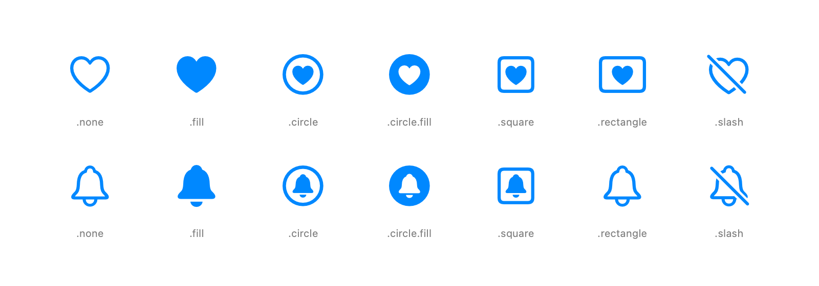
Variants combine, so .circle.fill and .square.fill both work. A symbol that doesn’t have the variant stays as it is. There’s no bell.rectangle, so the bell in the .rectangle column is a plain bell.
The modifier applies to every symbol inside a view. To fill every icon in a toolbar or a list section, set the variant once on the parent:
HStack {
    Image(systemName: "heart")
    Image(systemName: "bell")
    Image(systemName: "star")
}
.symbolVariant(.fill)
Weight and scale
Symbols are drawn like text, so they follow the font. Size and weight come from font, and a symbol next to a label lines up with its text.
Image(systemName: "paperplane")
    .font(.system(size: 36, weight: .ultraLight))

Label("Send", systemImage: "paperplane.fill")
    .font(.title2)
    .imageScale(.large)

Text("Symbols sit in text \(Image(systemName: "sparkles")) and follow its font")
    .font(.title3.weight(.semibold))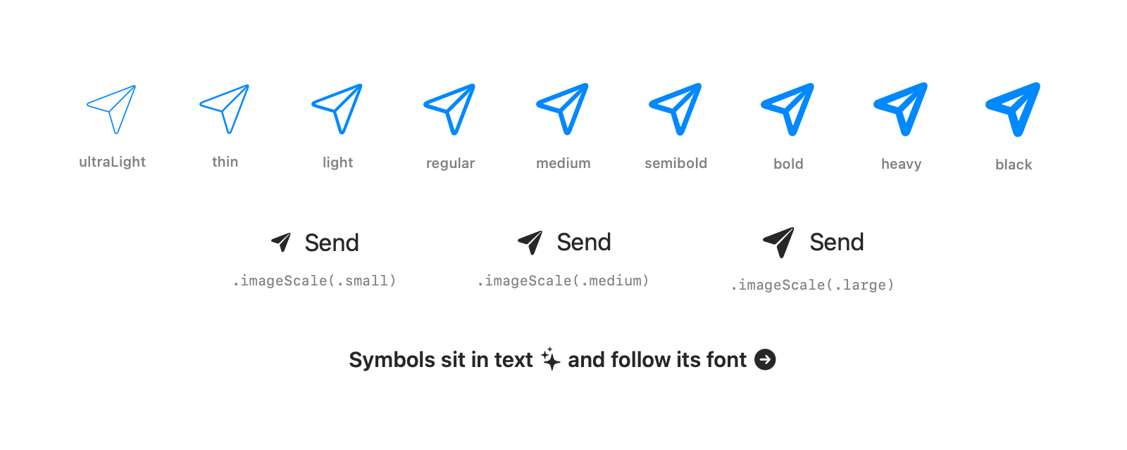
There are nine weights, from ultraLight to black. Match the weight to the text next to the symbol so both have the same stroke thickness. imageScale makes a symbol a bit smaller or larger than its font without changing the text, which is handy when a label’s icon looks too heavy or too light. A symbol inside a Text through string interpolation flows with the text and wraps with it.
Variable value
Some symbols can show a value from 0 to 1, such as signal strength or volume. Pass it with variableValue:
Image(systemName: "wifi", variableValue: 0.5)By default the symbol shows the value by coloring its layers, and layers above the value are dimmed. iOS 26 adds a second mode, .draw, that draws a path along the symbol up to the value.
Image(systemName: "thermometer.high", variableValue: 0.75)
    .symbolVariableValueMode(.draw)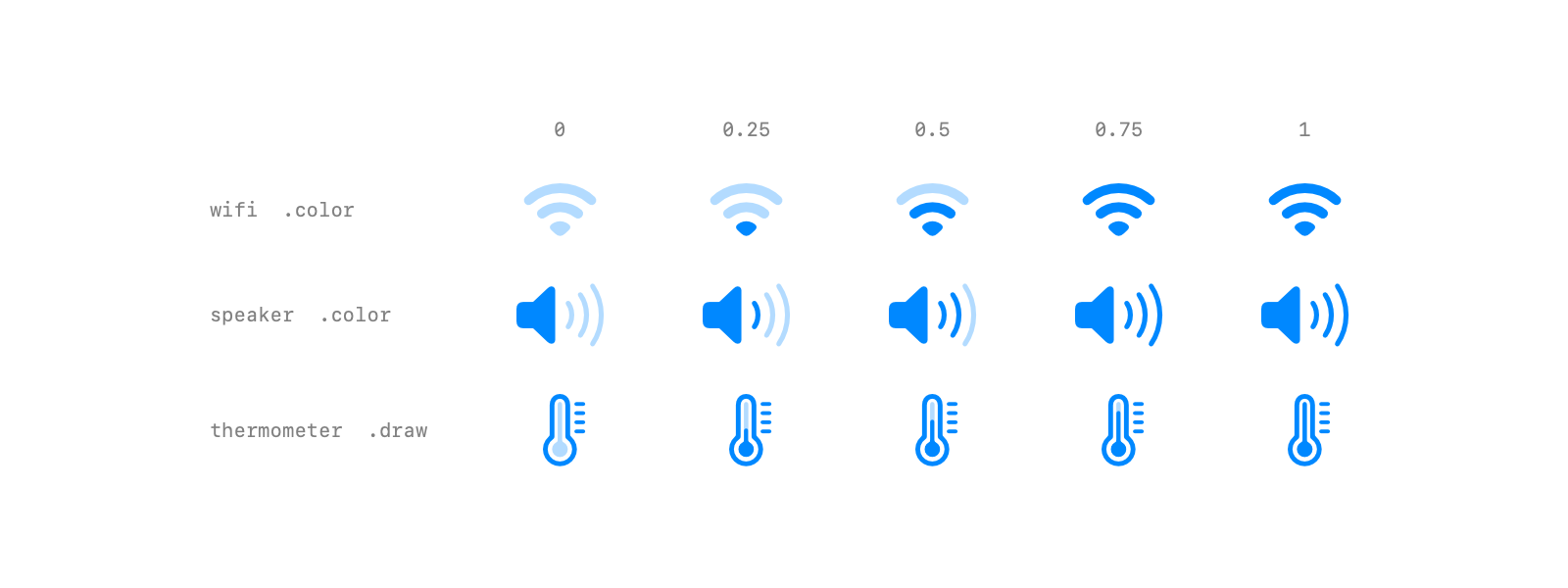
Symbols support one mode or the other. wifi and speaker.wave.3.fill change by color and ignore .draw. thermometer.high fills its tube with .draw and doesn’t change with .color. Check a symbol in the SF Symbols app before picking a mode.
Gradients
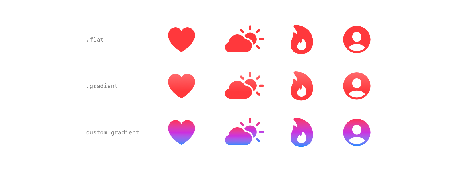
iOS 26 can render a symbol with a soft gradient made from its foreground color. It’s one modifier:
Image(systemName: "heart.fill")
    .symbolColorRenderingMode(.gradient)
    .foregroundStyle(.red)
For full control, pass any gradient to foregroundStyle. It’s applied across the whole symbol.
Image(systemName: "flame.fill")
    .foregroundStyle(
        LinearGradient(colors: [.pink, .purple, .blue], startPoint: .top, endPoint: .bottom)
    )
Symbol effects
Animations are called symbol effects. They all go through the same few modifiers, and each effect belongs to one or more categories that decide how it’s triggered:
| Category | Triggered by | Effects |
|---|---|---|
| Indefinite | isActive is true |
bounce, pulse, breathe, scale, wiggle, rotate, variable color, appear, disappear, draw on, draw off |
| Discrete | a value change | bounce, pulse, breathe, wiggle, rotate, variable color |
| Transition | view insertion and removal | appear, disappear, draw on, draw off |
| Content transition | the symbol changes | replace |
Bounce, pulse, variable color, scale, appear, disappear and replace need iOS 17. Wiggle, rotate, breathe and magic replace need iOS 18. Draw on and draw off need iOS 26.
Indefinite effects
An indefinite effect runs while isActive is true and stops when it turns false. Use it for ongoing states like recording, syncing or searching.
Image(systemName: "mic.fill")
    .symbolEffect(.scale.up, isActive: isRecording)

Image(systemName: "wifi")
    .symbolEffect(.variableColor, isActive: isSearching)
To keep a motion like bounce or wiggle looping, add .repeat(.continuous):
Image(systemName: "bell.fill")
    .symbolEffect(.bounce, options: .repeat(.continuous))

Image(systemName: "fan.desk.fill")
    .symbolEffect(.rotate.byLayer, options: .repeat(.continuous))
Scale is the odd one out. It has no motion of its own, so it simply grows while active and shrinks back when isActive turns false.
Most effects come in two flavors: .byLayer animates each layer with a small delay, and .wholeSymbol moves the symbol as one piece. Rotate by layer only spins the layers the designer marked to rotate, so the fan blades turn while the stand stays still.
Discrete effects
A discrete effect plays once each time a value changes. It’s the right fit for feedback: a download finished, a new message arrived, a refresh started.
@State private var downloads = 0

Image(systemName: "arrow.down.circle.fill")
    .symbolEffect(.bounce.down, value: downloads)
The value can be any Equatable. A counter is the simplest trigger. Effects also take direction modifiers: .bounce.up and .bounce.down, .wiggle.left, .wiggle.right, .wiggle.up, .wiggle.down, .wiggle.clockwise, and .rotate.clockwise or .rotate.counterClockwise. .wiggle.forward and .wiggle.backward follow the reading direction, so they flip for right to left languages.
Options control timing:
Image(systemName: "star.fill")
    .symbolEffect(.bounce, options: .speed(2), value: downloads)

Image(systemName: "star.fill")
    .symbolEffect(.bounce, options: .repeat(2), value: downloads)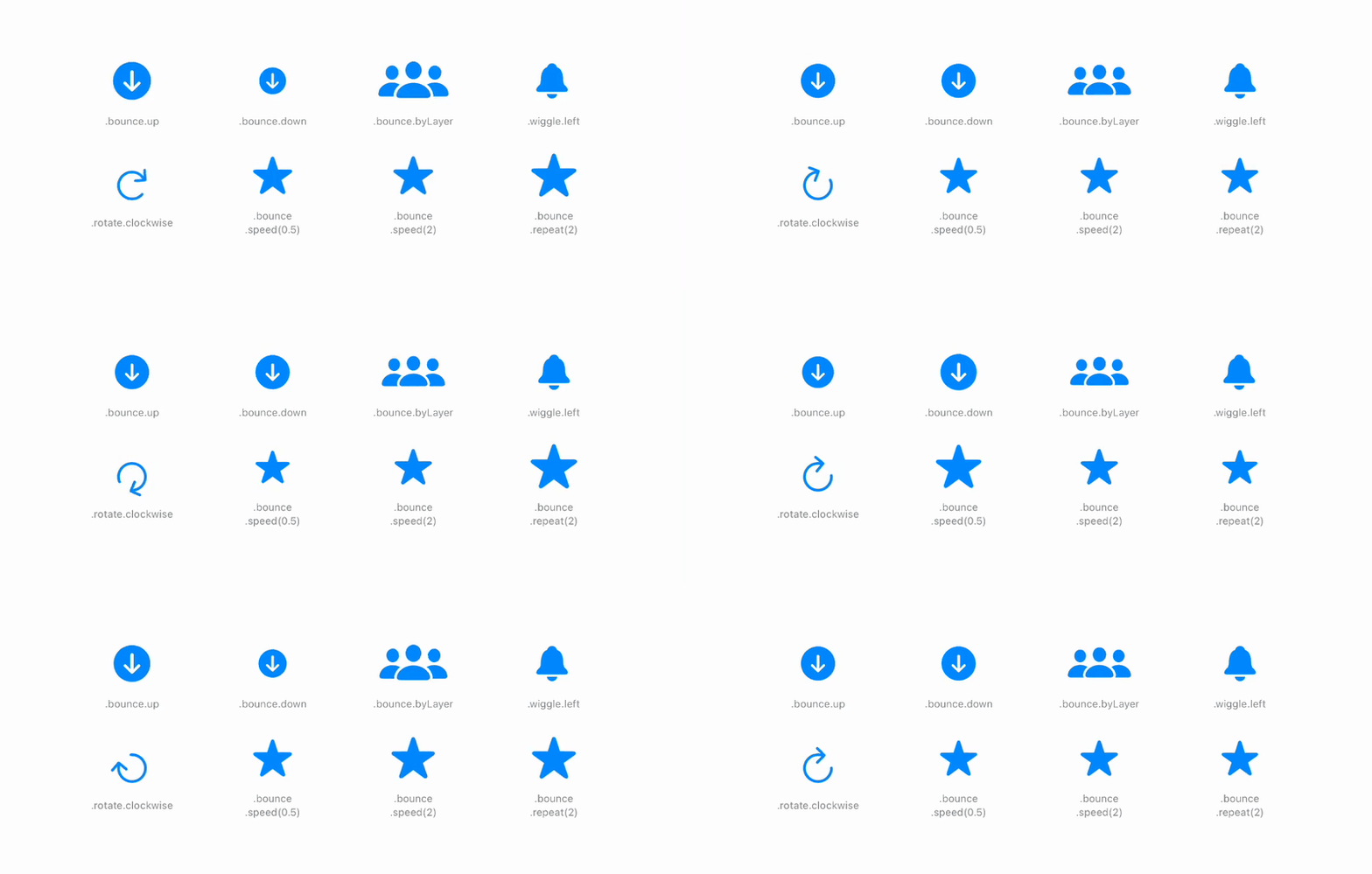
.speed multiplies the default speed. .repeat takes a count, .continuous, or .periodic(_:delay:) to pause between runs. Options chain, so .repeat(3).speed(1.5) works too.
Variable color
Variable color lights up a symbol’s variable layers in sequence. It has the most options of any effect:
Image(systemName: "wifi")
    .symbolEffect(.variableColor.iterative, options: .repeat(.continuous))

Image(systemName: "wifi")
    .symbolEffect(.variableColor.cumulative, options: .repeat(.continuous))

Image(systemName: "speaker.wave.3.fill")
    .symbolEffect(.variableColor.iterative.hideInactiveLayers, options: .repeat(.continuous))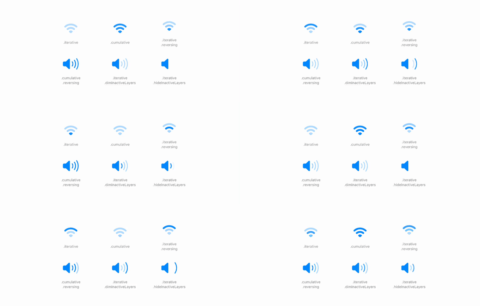
.iterative highlights one layer at a time, while .cumulative keeps the earlier layers lit as it goes. .reversing plays back down after reaching the end. Inactive layers are dimmed by default. .hideInactiveLayers hides them instead, which suits a speaker better.
Appear, disappear and draw
Appear and disappear show and hide a symbol with motion. Draw on and draw off, new in iOS 26, draw the symbol’s strokes like handwriting. They work as transitions when a symbol is inserted or removed:
if isDone {
    Image(systemName: "signature")
        .transition(.symbolEffect(.drawOn))
}
The change has to happen in an animation for the transition to run, for example withAnimation { isDone.toggle() }. Plain .transition(.symbolEffect) picks a fitting effect automatically.
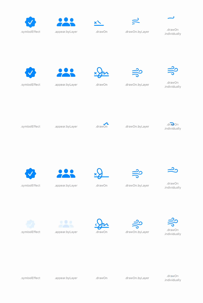
Draw on can sequence the symbol’s motion groups in three ways. .wholeSymbol draws them all at once, .byLayer animates each group separately with overlap, and .individually draws one group at a time. You can also keep the view in place and drive the same effects with isActive, for example .symbolEffect(.disappear, isActive: isHidden).
Replace
Replace animates from one symbol to another when the name changes. Apply it as a content transition:
Image(systemName: isPlaying ? "pause.fill" : "play.fill")
    .contentTransition(.symbolEffect(.replace))
It comes in three directions: .downUp, .upUp and .offUp.
Magic replace, in iOS 18, morphs between related symbols instead of swapping them, like a bell gaining a slash or a circle filling in. Give it a fallback for pairs that aren’t related:
Image(systemName: isMuted ? "bell.slash.fill" : "bell.fill")
    .contentTransition(.symbolEffect(.replace.magic(fallback: .downUp)))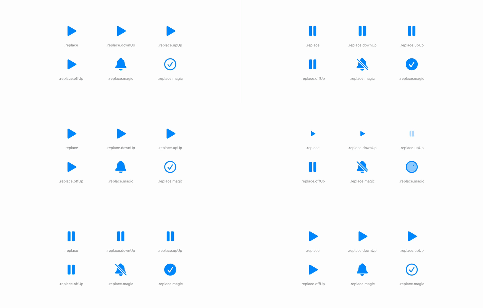
Turning effects off
Apply symbolEffectsRemoved() to a view to switch off every symbol effect inside it. It’s useful in places where motion is a distraction, like a dense list, or in snapshot tests.
List(items) { item in
    Row(item: item)
}
.symbolEffectsRemoved()
Start the conversation